

Four Common User Experience Design Mistakes You Should Avoid
You’ve heard it a thousand times: good design is essential to an online business. But you’d be surprised at the volume of marketing efforts that go to waste simply because of bad web design. Web marketing isn’t a personal project; it’s a public performance. You’re not designing for yourself; you’re addressing an entire potential market. Below are some design errors that can be fatal to your web marketing campaign.
Mistake #1: Putting design first
Don’t treat your SEO campaign as an afterthought, or an accessory to your design. The rule is to optimize first and design second. Pages should be built around search-optimized content, rather than the other way around. Do your keyword research (or bring in your search specialist) early in the site-building process, so you can plan out your navigation, headings, categories, and cross-links before building that first page.
Mistake #2: Unfocused content
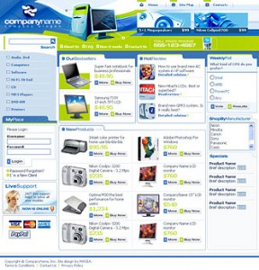
Each of your pages must focus on one or two concepts. Even Amazon, the biggest retailer on the Web, will not overload you with products from every single department, even if you’re able to buy them all. Make sure each page has a focal point: something that looks clickable, a highlighted keyword phrase, or a few eye-catching pictures.
For example, with eCommerce sites, we recommend creating a custom front-page that focuses on the most important products. The objective is to guide your users to the sale with relative ease. Master the art of the unobtrustive sales pitch on the web.

Mistake #3: Making a splash page
Splash pages are those static images or Flash loops that require you to “Click to Enter” or “Skip Intro.” They may work for a teenager’s blog or an artist’s online portfolio. But in this search-engine-driven industry, they’ve long fallen out of fashion. Splash pages ruin your marketing campaign because 1) they lack keywords; 2) they don’t have enough cross-links to boost your rankings; and 3) they turn off half your readers.
Mistake #4: The brochure syndrome
The brochure syndrome is common among older businesses moving their operations online. Its defining characteristic is a lack of forms—the site is basically a gallery, chic and impressive but unable to generate a single lead. Not everyone who visits your site will want to buy your stuff on the same day. Forms allow you to stay in touch and keep them interested until they’re ready to do business.
