

Web Typography 101
Back when the Web was in its infancy, typography was the least of our concerns. There was pretty much only one font in circulation, and on-screen images were still a thing of the future. But we’ve come a long way since then—even a non-techie can vouch for that. Now that we have a whole array of fonts at our disposal, typography has become a crucial part of Web design, and a strong if subtle force in online marketing. Simply put, typography can make or break your business.
Good web typography rests on four main elements: size, contrast, space, and hierarchy. Let’s look at each one in detail.
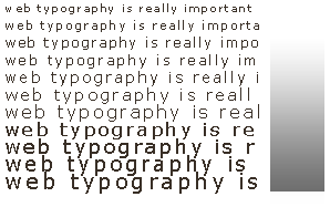
Size
For some reason, websites in the past few years have tended towards exceedingly small type. Some do it to save space, others to create a minimalist look, while others are simply “going with the trend.”
Well, this trend didn’t last very long, and for good reason. As typographer Robert Bringhurst says, typography is made to honor content—and shrinking it to microscopic scales in the name of fashion is doing quite the opposite. Never use fonts smaller than 10pts, and when in doubt, just make it bigger.
Contrast
Yellow text on a pink background might look good on a shirt, but on a web page, it’s plain eye torture. Your text is there to be read, not squinted at. Personally I like good old black and white (it’s classic for a reason), but any light/dark combination should work. Here’s a quick trick: take a screenshot of the page, convert the image to grayscale, and see if it’s still readable. If you get a barely discernible soup of gray, then you may want to rethink your text colors.
Space
Tightly packed text is one of the hallmarks of bad design. If you don’t have a lot to say, it’s perfectly okay to leave some spaces blank. This is known as white space—the unused areas that naturally lead the eye towards your content.
Professional typographers spend hours perfecting white space down to per-character scales; your job is to perfect the large-scale white space that shapes your text.
Hierarchy
Colors differentiate one picture from another. Likewise, the relative sizes of your text—your type hierarchy—say something about the importance of each block of text. Headings are easily identified by their large type, subheads by their location and medium type, and the body text by their smaller sizes and larger volume. You wouldn’t have it any other way, and neither would your readers. Just remember to keep things consistent—use no more than three levels of hierarchy throughout the site.
